Thinking of making a wall stand out but not sure whether to go bold or subtle? Many homeowners confuse feature walls with accent walls, but while the terms are often used interchangeably, the two approaches create very different effects.
This guide unpacks the difference, explores when each works best, and shares modern wall design ideas for New Zealand homes — from bold paint colours and textured wallpaper to timber panels and budget-friendly tricks.
Key Takeaways
- Understand the difference so your wall sits within a cohesive design palette.
- Use colour, sheen and panels to create depth without overpowering the room.
- Assess light, sight lines and furniture before committing to paint or wallpaper.
- Small projects can refresh a space; larger timber or panel work adds longevity.
- Pick palettes that reflect personality but stay flexible with trends.
Feature Walls vs Accent Walls: Clear Definitions
What Is a Feature Wall?
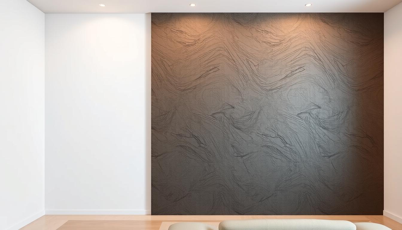
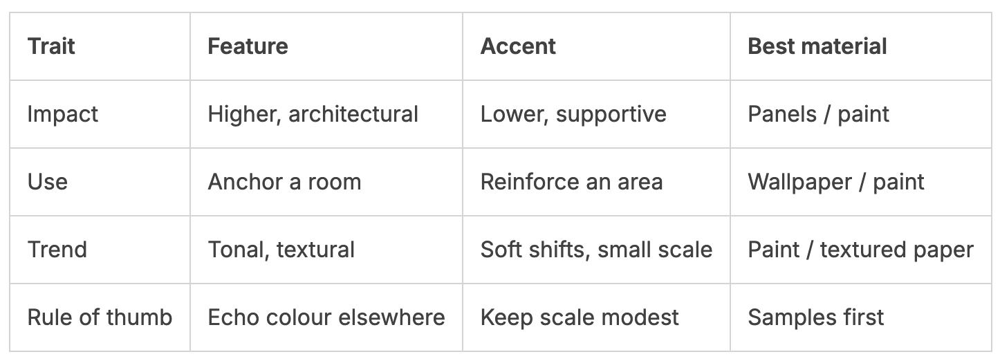
A feature wall is a bold, highlighted surface designed to become the focal point of a room. It often uses strong colour, textured wallpaper, or panels to draw the eye.
When to use:
- To anchor a lounge (e.g., behind a fireplace or TV).
- To frame a bedhead wall in a bedroom.
- When minimal furnishings need visual weight.
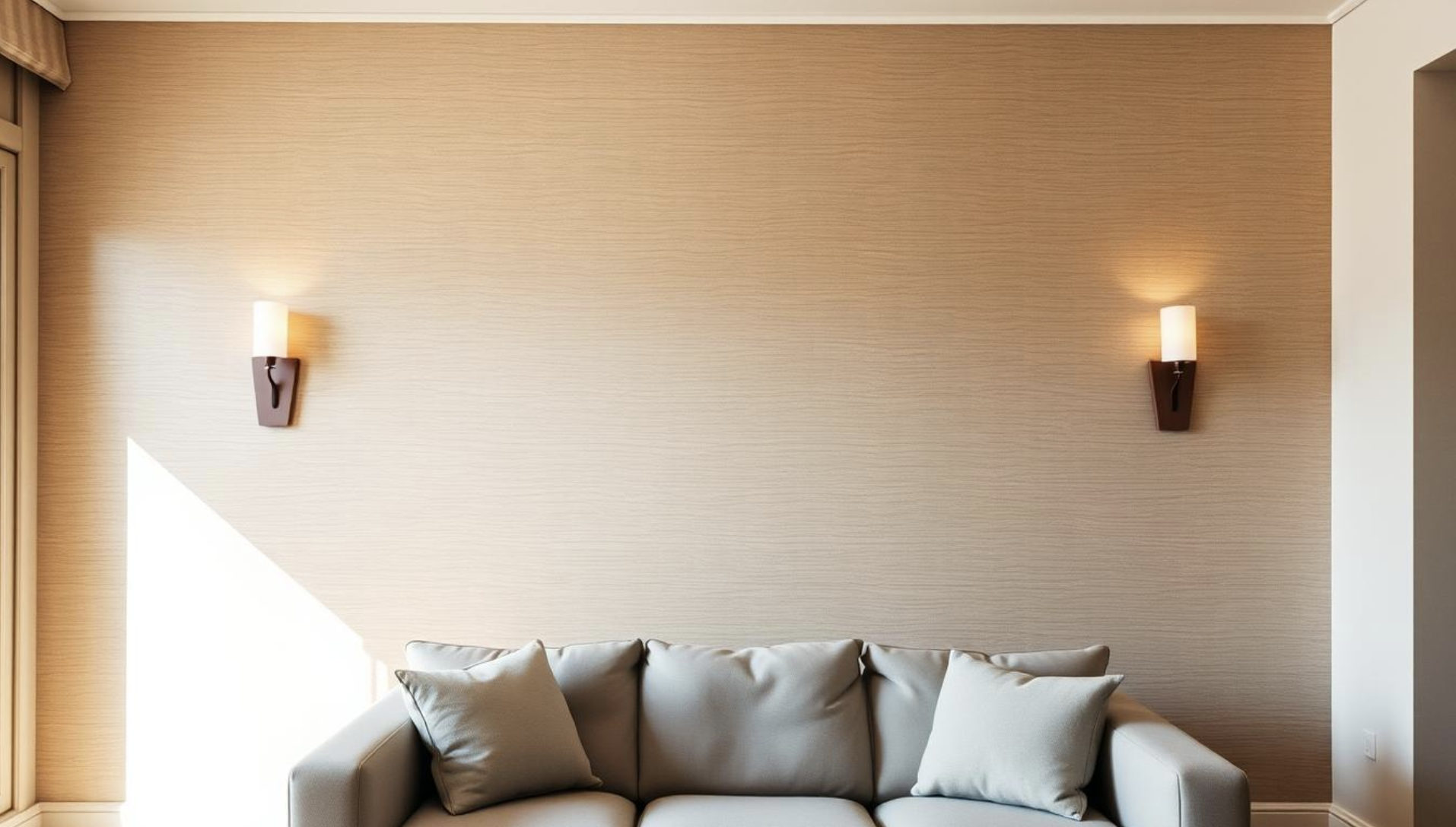
What Is an Accent Wall?
An accent wall is more subtle. Instead of shouting for attention, it supports the room by introducing softer shifts in colour or texture that repeat elsewhere (in cushions, rugs, or artwork).
When to use:
- To create calm cohesion in a bedroom or study.
- To highlight dining banquettes or built-in shelving.
- To add gentle pattern without overwhelming a space.
Key visual and functional differences
- Feature walls often carried high contrast in the 1990s and 2000s; that look can feel jarring now without a supporting palette.
- Modern approaches favour tonal colour, textured wallpaper or panels so the special wall reads as a backdrop, not an island.
- An accent wall might be a soft stripe or wash that repeats tones elsewhere — cushions, art or a rug — to keep the scheme resolved.
Feature Walls vs Accent Walls: which is right for your room?
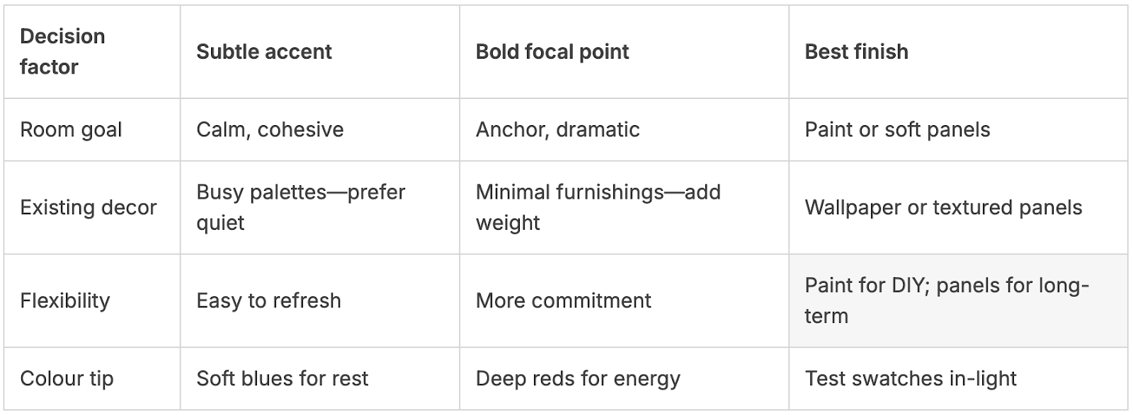
Choosing between a bold focal treatment and a soft backdrop starts with how you want the room to feel and function. Think of the wall as a tool: it can anchor a lounge or make a bedroom calm.
When to choose a subtle backdrop versus a bold focal point
Start with your room goals. If you need calm, choose a tonal accent wall. If you need drama, pick a deeper colour or textured feature wall to act as the focal point.
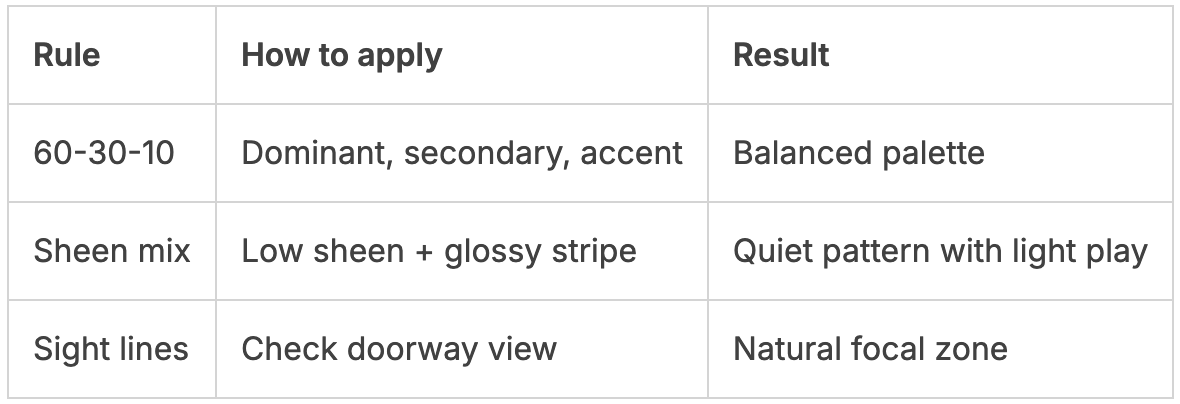
Apply the 60-30-10 rule: 60% dominant colour, 30% secondary, 10% accent. Let the chosen wall carry the 10% or 30% depending on how bold you want the space to read.
Matching the choice to your home’s personality and palette
Use colour psychology. Red adds energy to entertaining zones; blue soothes a bedroom or study. Match your wall to how you use the room and the overall palette.
- Check existing focal points—fireplace or TV—and avoid creating competition.
- If your palette is busy, pick quieter paint or subtle panels.
- Order swatches and view them in morning and evening light before you commit.
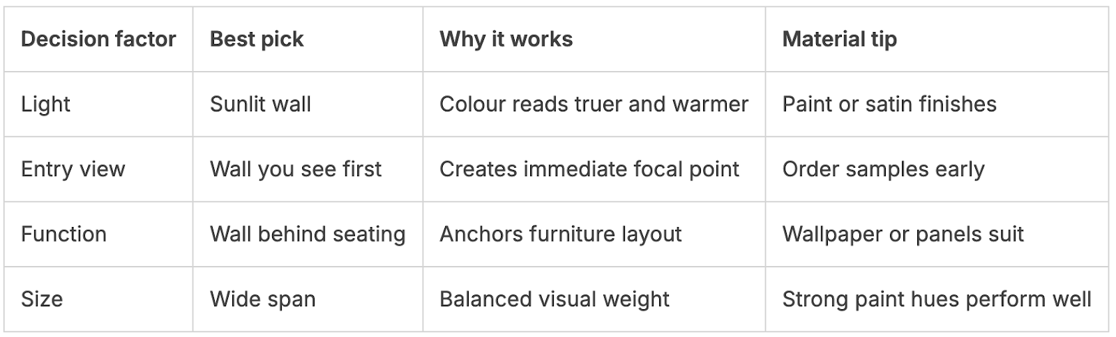
How to choose the right wall to highlight
Finding the best wall starts with light and sightlines. Watch the room through a day to see which surface catches soft, flattering light. That wall will make colour look richer and more inviting.
Next, test the entry view. The first wall you see should earn attention. If an accent wall hides behind a door or a cluttered cupboard, it will feel like an afterthought.
Natural light and entry points
Track daylight—afternoon sun often shows how paint or wallpaper will read. Use the entry view test to ensure the focal point greets visitors, not hides.
Furniture and function
Let furniture guide you. In a living room, the wall behind the sofa or TV is a natural anchor. In a bedroom, the bedhead wall works best. Dining banquettes benefit from an integrated backdrop.
Architectural cues and proportions
Celebrate clean features like fireplaces or niches. Avoid highlighting messy service walls, beams or outlet clusters.
Think proportionally: narrow slivers rarely hold bold treatment. Go for larger spans where possible for balance.
- Map light and entry views.
- Match treatment to surface—paint for smooth walls, wallpaper for flat panels, and panels to hide flaws.
- Order samples and use painter’s tape before you commit.
Design rules that work now
Good design treats a painted surface as part of the room’s conversation, not its final word. Use simple rules to keep a chosen wall feeling intentional and modern in a New Zealand home.
The 60-30-10 rule for colour balance
Apply the 60-30-10 framework so a single surface sits in balance with the whole palette. Let 60% be the room’s dominant colour, 30% a supporting tone, and 10% your accent.
Colour psychology: calm blues, energetic reds and cosy neutrals
Choose hues that match how you use the room. Soft blues calm bedrooms and studies. Deeper reds lift living and dining zones. Warm neutrals make a space feel cosy and enduring.
Creating cohesion: avoid harsh contrasts and one-wall “islands”
- Echo the wall colour in cushions, throws or art so the eye reads a connected story across walls and furnishings.
- Avoid a single high-contrast island; repeat tones to knit the scheme together.
- If you love pattern, prefer tonal wallpaper or a subtle paint technique to add interest without noise.
Layering: make your wall a backdrop, not the end point
Treat the surface as a backdrop. Layer art, mirrors and shelving so the wall supports furniture and textiles rather than ending the conversation.
Practical tip: tape large swatches to the chosen surface and view them at different times of day. Test paint and finish so trends guide you, not dictate you, and the whole room reads cohesive and intentional.
Paint, wallpaper or panels: choosing the best finish
The finish you pick changes how colour, texture and light work together in a room.
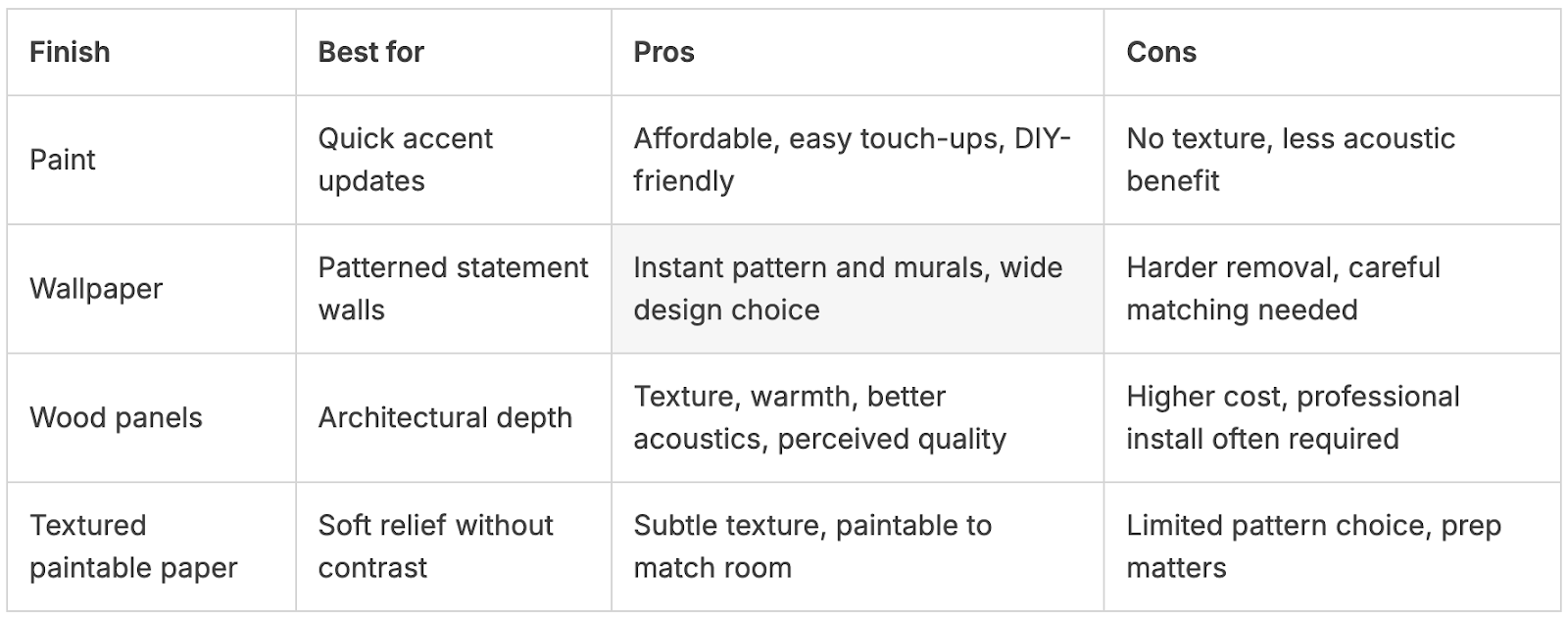
Paint is fast, affordable and flexible. It’s the best way to trial a bolder colour on an accent wall without long-term commitment. Paint offers easy touch-ups and simple DIY for most NZ projects, though it won’t add tactile depth.
Paint accent walls: fast, affordable, and easy to refresh
Choose paint for speed and flexibility. Stripes are easy to tape and paint, and mixing low sheen with a gloss stripe creates subtle light play.
Wallpaper statement walls: patterns, stripes and murals
Wallpaper delivers instant pattern and drama, ideal for a statement wall where visual busyness is controlled. Removal can be cumbersome, so order swatches and test how the pattern reads at viewing distance.
Wall panels in wood: texture, warmth and better acoustics
Timber panels add tactile warmth and perceived quality. They improve room acoustics and create architectural depth, but expect higher cost and professional installation for the best result.
Ordering samples and testing colours in your space
Order products samples—paint drawdowns, wallpaper swatches and panel offcuts. View them on the chosen wall at different times of day to check colour and texture.
- Maintenance: paint is easy to refresh; wallpaper needs care to remove; panels are robust but need a plan.
- DIY: start small with paint, then move to murals or panel systems as skills grow.
- Prep: fill, sand and prime. Quality prep makes colour and finish look their best.
Room-by-room ideas for living, dining, kitchens and bedrooms
Small changes to a single surface can reshape how a room reads and how you use it. Pick the wall that naturally anchors activity and treat it to colour, paper or panels so the result feels intentional.
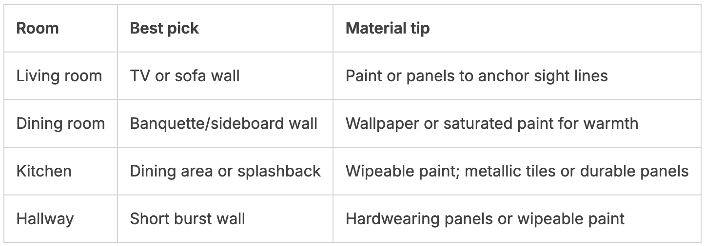
Living room: TV walls, fireplaces and the wall behind the sofa
In a living room, mark the TV wall or the wall behind the sofa to keep sight lines and seating aligned. A saturated paint or timber panels behind a fireplace adds depth while nearby walls stay tonal for balance.
Dining room: the wall behind a banquette or sideboard
The dining room benefits from a framed backdrop. Use a rich paint or subtle wallpaper behind a banquette or sideboard to create a calm gathering area without overwhelming table settings.
Kitchen: define dining areas and splashback statements
In open-plan kitchen spaces, define the dining area with colour or soft patterned wallpaper. Splashbacks are trending beyond red to oranges, yellows and metallics for a high-end look.
Practical tip: choose wipeable paint or durable finishes in busy kitchen areas.
Bedroom: bedhead walls for restful focus
Use soothing colour on the bedhead wall to support rest. Reserve bolder pattern for artwork or slim stripes so the room stays calm at night.
Hallways and landings: small spaces with big impact
Hallways are perfect for brief, bold statements. Try a rich hue, compact panels or wallpaper opposite painted walls to correct proportions in long, narrow runs.
- For long skinny rooms, try wallpaper on opposite walls and paint the rest to balance movement.
- Flip a chimney: paper the returns and paint the breast to add texture without bulk.
- Start diy with one modest project—a single wall behind shelving—for a quick, low-risk win.
New Zealand-friendly choices: Resene colours, sheens and trends
Start with how your home faces the sun — this guides the palette and the right sheen for each area. In NZ light, some colours read vivid while others soften, so test before you commit.
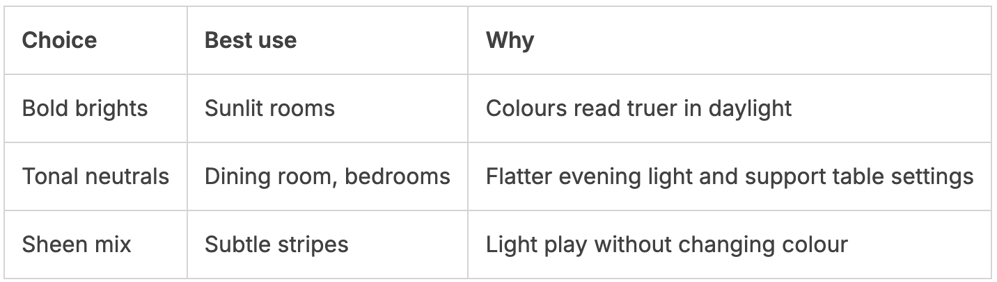
Resene palettes: bold brights, tonal neutrals and stripes
Resene suggests using bold brights like those that sing in clear daylight or tonal neutrals for heritage and modern homes. Try Resene Innocence for a soft base or Resene Double Ash for a warm neutral anchor.
Use stripes to change proportions. A tonal stripe can widen or heighten a wall without adding visual noise.
Mixing paint sheens for subtle pattern and light play
Mix low sheen and gloss to create a refined stripe that catches light. The effect is subtle: the base colour remains the same, but shimmer adds depth.
Order drawdowns and order samples so you can view sheens in morning and evening light.
Outdoor feature walls and front doors with high-impact colour
Outdoors, pick products and finishes built for Kiwi sun and humidity. High-gloss front doors in red or black give instant kerb appeal.
Consider a compact coloured garden wall as a backdrop for pots or a vertical garden. For splashbacks, trending tones include orange, yellow and metallics — choose wipeable, quality finishes.
- Use the Resene fandeck to match cushions and accessories.
- Local ColorShop consults help you select the right product for coastal or high-sun sites.
- Panels add durability in entryways and kid zones while keeping the interior palette cohesive.
Budget-savvy ways to make a statement
Try a smart, low-cost approach to make a big impact without renovating the whole room. Order samples early so you can compare paint drawdowns, wallpaper cuttings and panel offcuts in your light.
Use samples, panels and framed wallpaper to stretch your budget
Order samples and test them on the chosen surface before you buy full products. Framing wallpaper panels creates an instant luxe look and saves on covering one wall end to end.
Small projects: cupboards, shelf backs and the “fifth wall” ceiling
Refresh cupboard doors with a pop of colour or paper shelf backs for boutique-style joinery. A painted or striped ceiling — the fifth wall — adds drama while keeping walls calm.
- Paper the returns of a chimney and paint the breast for texture without excess product waste.
- Use wood panels where traffic needs durability; paint above to save cost.
- Focus on one wall that holds the view so your spend goes further.
Conclusion
Let the chosen surface support the room’s story, rather than trying to steal it.
Pick a wall with a clear sight line and echo its colour in cushions, art and textiles so the outcome feels intentional. Use this guide to match palette and finish to your personality and daily use.
Panels add depth and long‑term quality where it matters. Paint keeps small projects nimble and refresh‑friendly, while framed wallpaper or a fifth wall offer budget-smart drama.
Order samples, test them in your light, then order product with care. Scale up slowly: build on wins so each new project links rooms into one calm, connected home.
FAQ
What’s the main difference between a focal wall and an accent wall?
A focal wall is designed to be the room’s main visual anchor, often incorporating bold colour, pattern, texture or architectural detail. An accent wall is usually subtler — it adds interest without overpowering the whole space. Think of one as a statement and the other as a complementary highlight that supports the room’s palette and furniture.
When should I pick a bold statement wall over a more understated backdrop?
Choose a bold option if you want a clear centrepiece — for example behind a sofa, bedhead or fireplace. Opt for a subtler approach when you need cohesion across an open-plan area or want the view, light or furnishings to remain the star. Consider how often you’ll want to update the look and how the wall will work with your existing palette.
How do I select the right wall to highlight in a room?
Start with where your eye is naturally drawn: the wall you see first on entering, the wall behind the bed or sofa, or the one with a fireplace or big window. Check natural light and traffic flow, and make sure furniture layout supports the choice — avoid picking a wall that will be mostly covered by a large cabinet or TV if you want the surface to show off colour or pattern.
What role does natural light play in the choice?
Light changes how colour and texture read. Bright northern light makes colours pop and can handle deeper tones, while dimmer spots suit warmer, lighter hues and textured finishes that reflect a little more light. Test swatches at different times of day to see how the finish behaves before committing.
Are there simple design rules that help balance a room’s colour?
Yes — use the 60-30-10 approach: 60% dominant colour (walls/floor), 30% secondary (soft furnishings), 10% accent (the highlighted wall and accessories). Keep cohesion by repeating tones in textiles and finishes, and avoid creating isolated colour “islands” that clash with the rest of the room.
Paint, wallpaper or timber panels — which finish should I pick?
Paint is the quickest and most flexible option. Wallpaper brings pattern and scale that paint can’t; it’s great for murals or stripes. Timber or acoustic panels add warmth and texture and can improve sound in living rooms or media spaces. Choose by budget, durability needs and the level of impact you want.
How should I test colours and patterns before starting a project?
Order physical samples or small paint pots and apply them directly to the intended wall area. View them at different times of day and with your room’s lighting on. For wallpaper, pin a length up to see pattern scale. This avoids surprises and helps match trims, flooring and upholstery.
What are good wall ideas for living rooms, dining areas and bedrooms?
In living rooms, highlight the wall behind the sofa or TV. Dining rooms favour the wall behind a banquette or sideboard. In kitchens use a patterned splashback or a painted zone to define a dining nook. For bedrooms, the bedhead wall works well with calming colours or soft textures to promote rest.
Can I use strong colour or pattern in a small hallway or landing?
Absolutely — small spaces are ideal for high-impact choices. A deep hue, stripe or framed wallpaper panel can create drama without overwhelming. Keep ceilings light to avoid making the space feel cramped, or make the ceiling the “fifth wall” for an unexpected touch.
How can I achieve a high-end look on a tight budget?
Stretch your budget by using samples, framed wallpaper panels, or by painting mouldings and shelf backs instead of full-wall treatments. Reupholstering a cushion or adding coordinated art can tie a cheaper finish into a polished outcome. Focus on one strong element rather than many small changes.
Are there local product tips for New Zealand and Australia?
Look to reputable paint brands like Resene and Taubmans for a wide palette and durable finishes. Choose low-VOC options for indoor air quality, and match gloss levels to application — eggshell or low sheen for living spaces, harder-wearing finishes for kitchens. Many suppliers offer sample pots and small wallpaper runs to trial designs easily.
What should I avoid when creating a single standout wall?
Avoid harsh contrasts that clash with major furniture pieces, placing the highlight on a wall that will be mostly hidden by storage, or choosing a pattern scale that overwhelms the room. Also steer clear of overly trendy finishes if you plan to keep the look long-term.